Primary Function
Brand Identity
Description
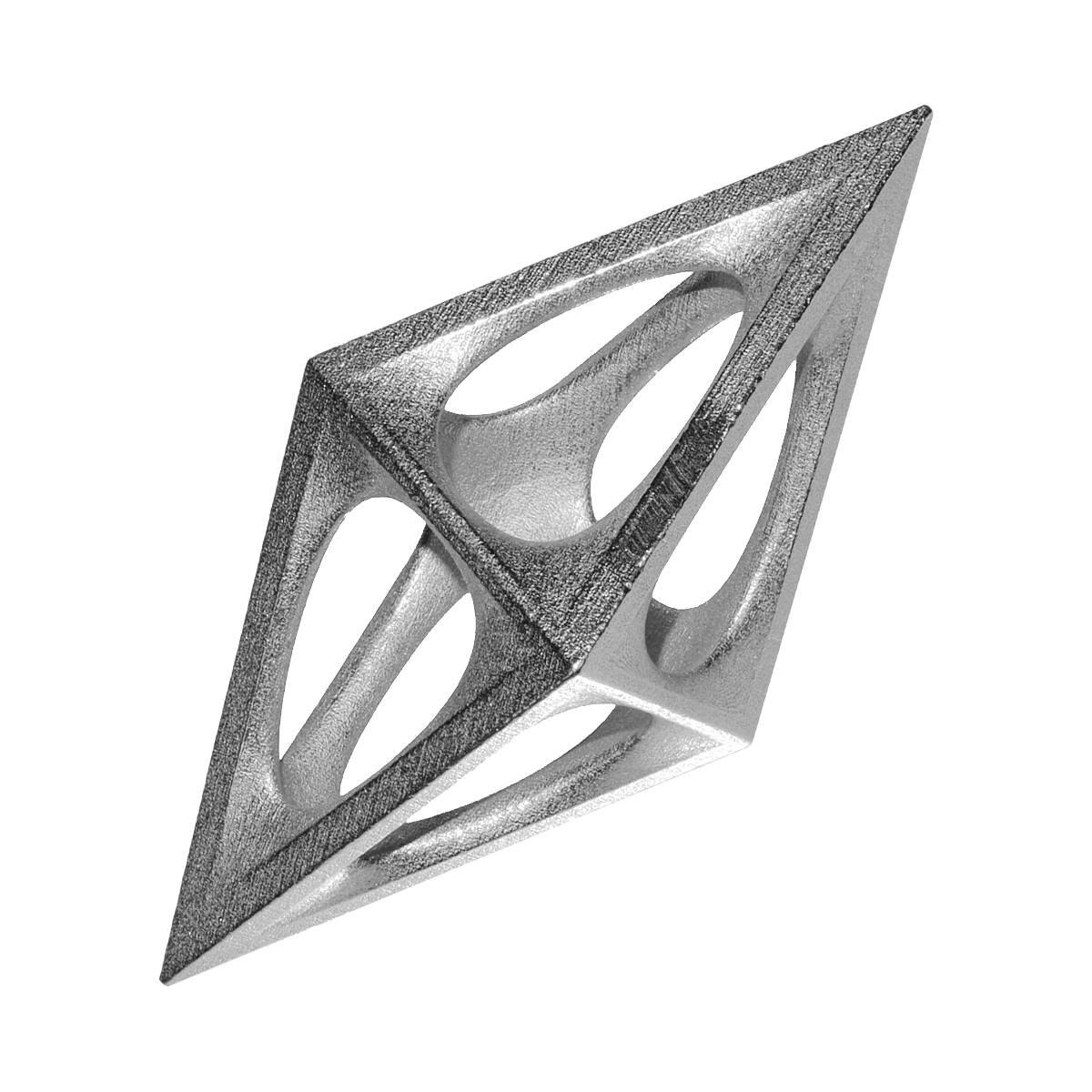
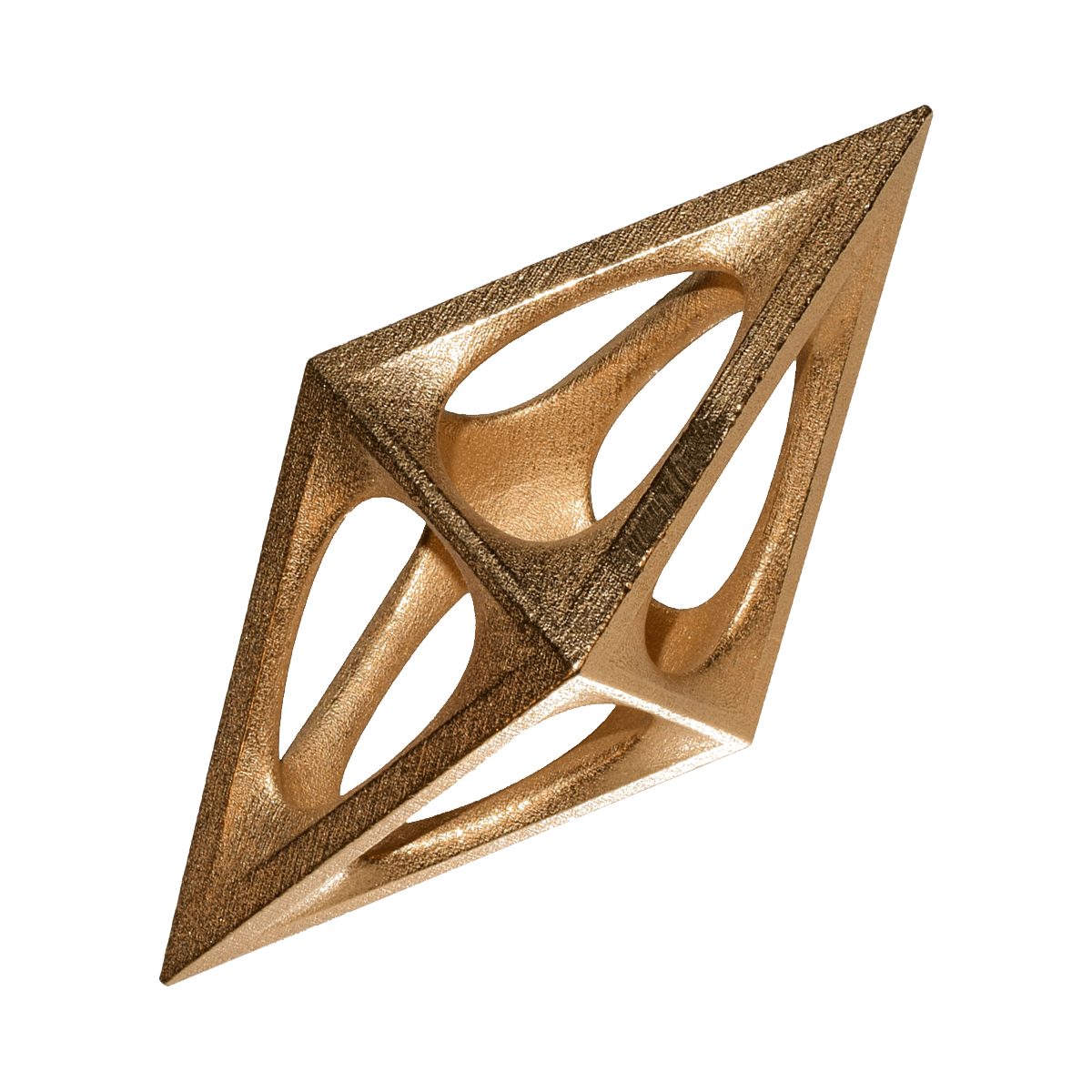
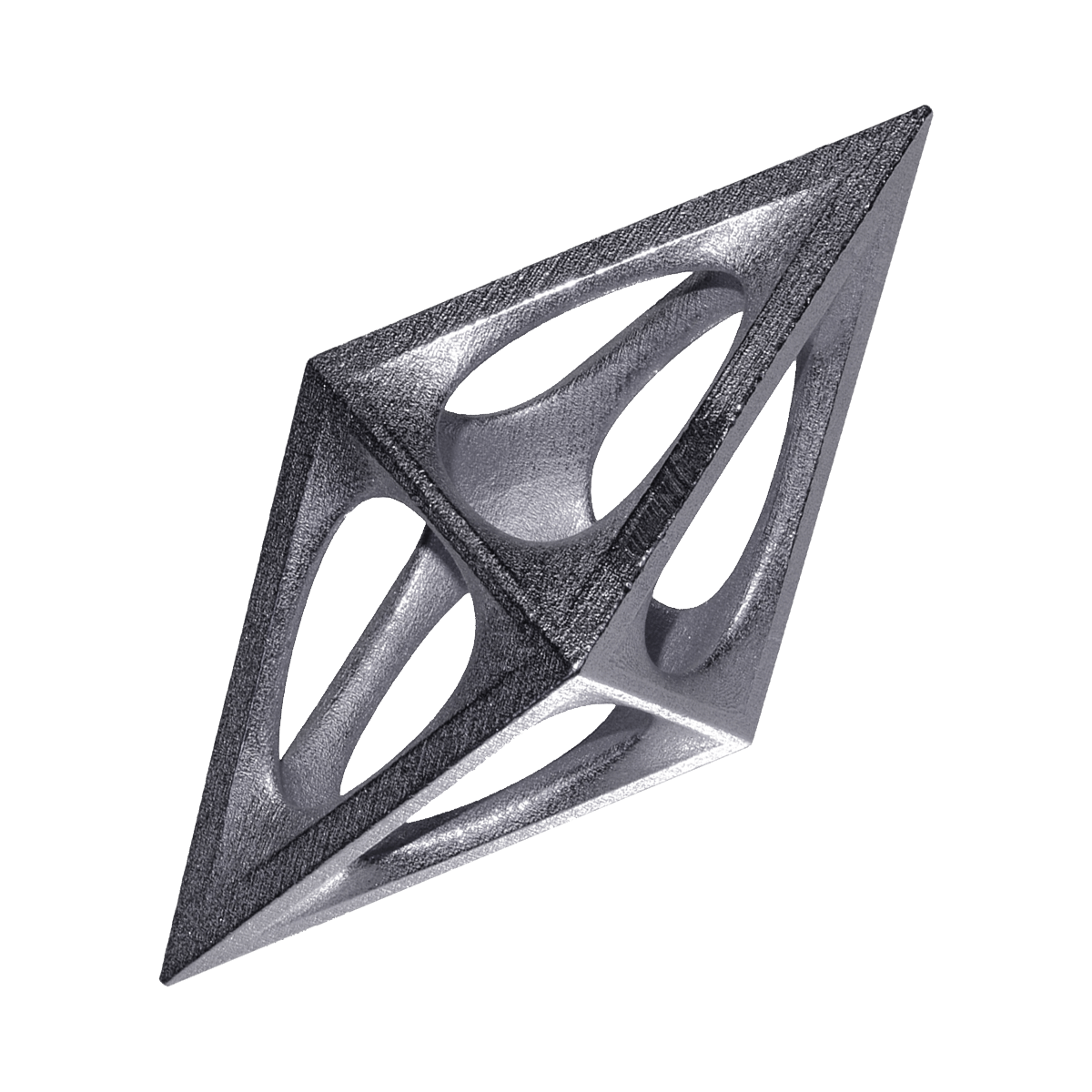
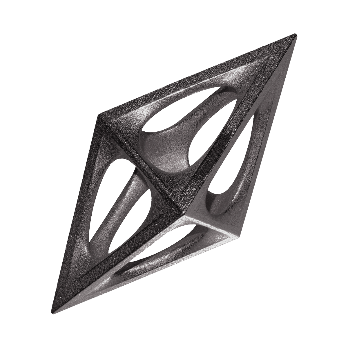
Cristaderm, a Korean skincare brand, that blends scientific innovation with sophisticated design. Inspired by DNA double helix, its visual identity features intricate molecular motifs and Korean characters, creating a refined aesthetic. The logo, with a clean font and parallelogram motif, symbolizes precision and innovation. The icon system merges chemical molecular formulae with Korean characters, adding cultural and intellectual depth. This thoughtful design ensures image of Cristaderm is effective and visually striking, setting a new standard in skincare.
Details
| Category |
Award Status |
Year |
Designed For |
| Graphics, Illustration and Visual Communication Design |
Iron |
2025 |
Cristaderm |